Competitor Study for Structured Shift Instructions - Airbnb and others
What makes Airbnb’s UX so great?
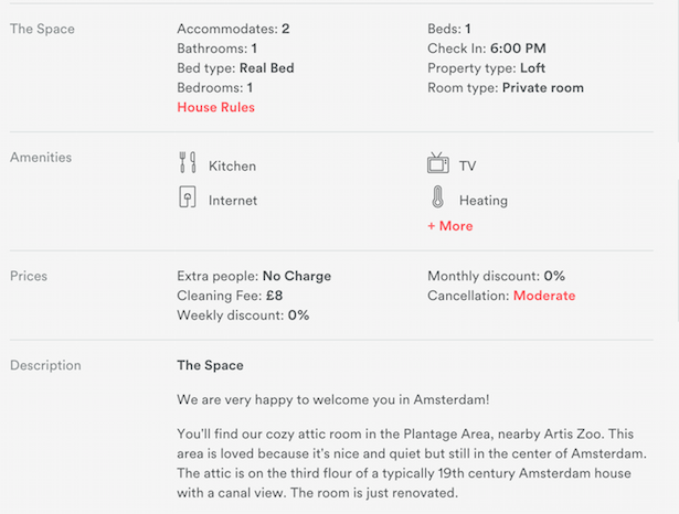
Clear presentation of information
Home listings require detail – number of bedrooms, cooking facilities, wifi, the proximity of local amenities etc. Presenting the details without cluttering the page or making it difficult to scan and understand becomes important. Airbnb uses features like symbols, icons, and bold highlighting to help users scan, while information is laid out with plenty of space.
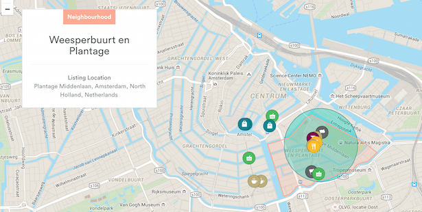
Neighbourhood guides
This is a great feature, and very useful for visitors unfamiliar with a particular destination.The hosts have recommended cafes, restaurants, great places to shop in the area near their apartment, shown on this map. It’s useful when deciding whether to book, but also when you arrive, so you can find a good restaurant without having to gamble.
Images
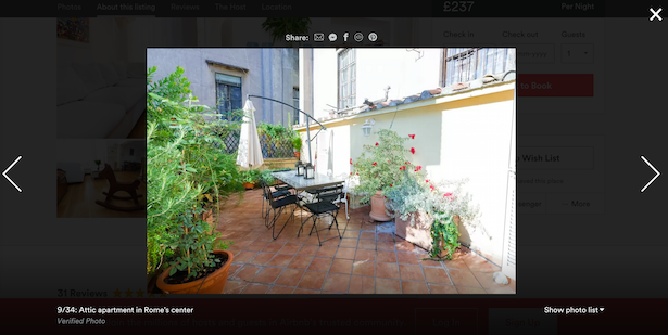
Airbnb works around images. The homepage is image-heavy, but the most crucial use is in apartment listings. Many travel sites used to expect that a couple of small images would work, but people want to see detail. It’s a huge part of the decision on whether or not to book. It’s up to the homeowners to take and show a good range of images, but Airbnb ensures they are presented well. There are a few key features here:
- Plenty of images.
- Images showing views from apartments.
- Images showing key features – beds, cooking equipment etc.
- The presentation. By showing in a lightbox like this, Airbnb makes it easy to browse photos.
Additional Information for Hosts
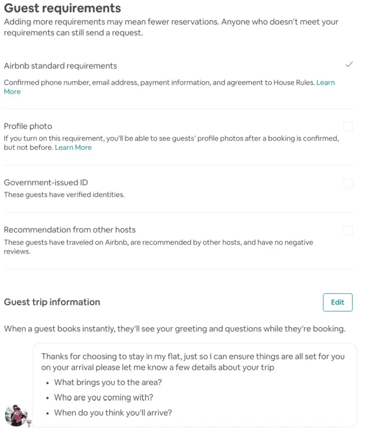
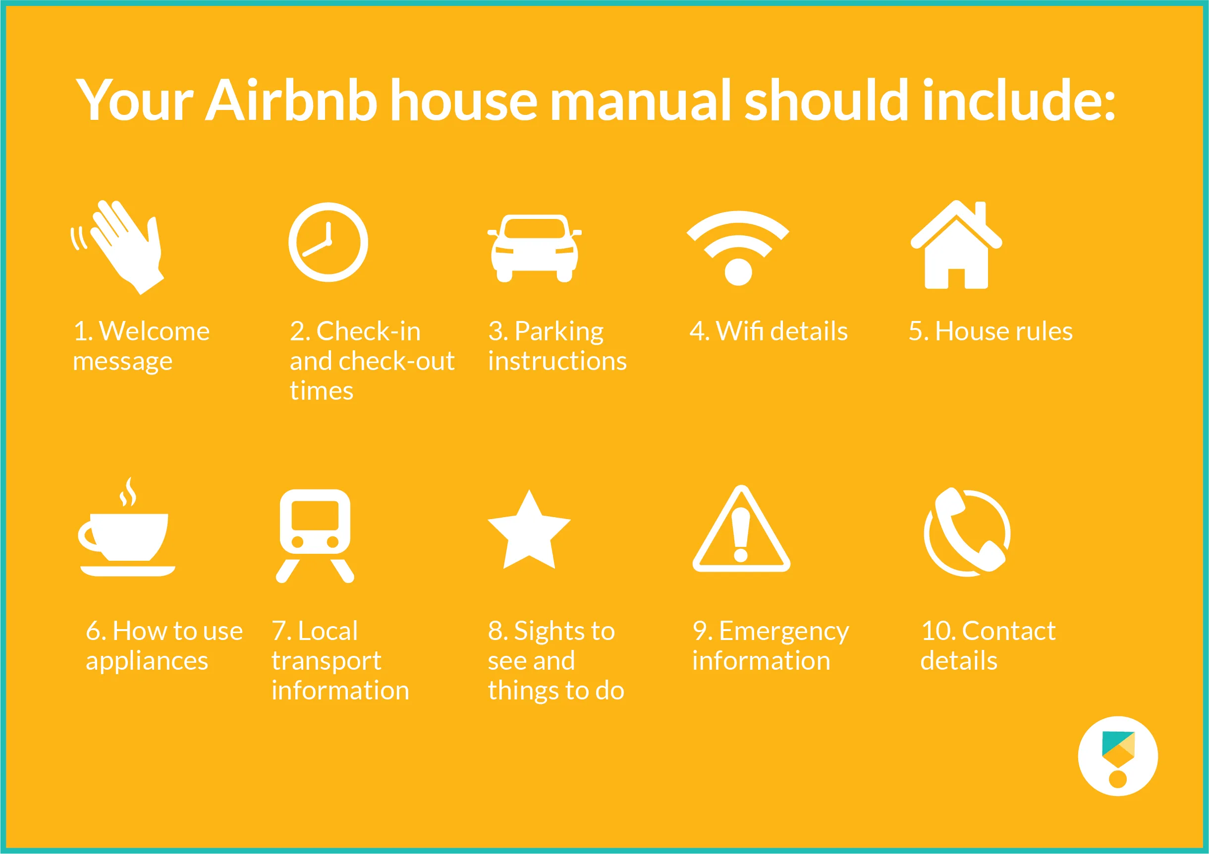
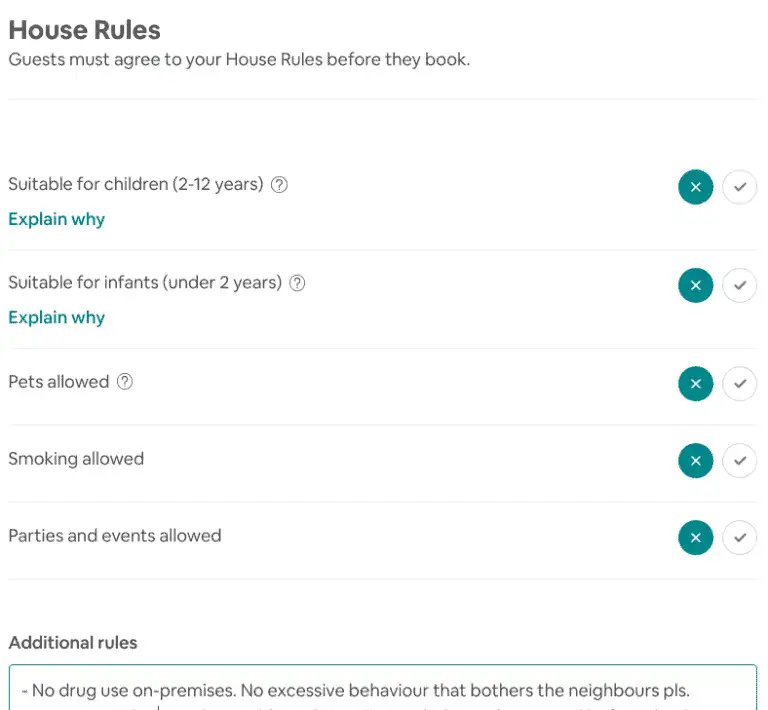
One can set this under the house rules sections of ‘booking settings’ on the listing while setting up their room for Airbnb.
Booking.com
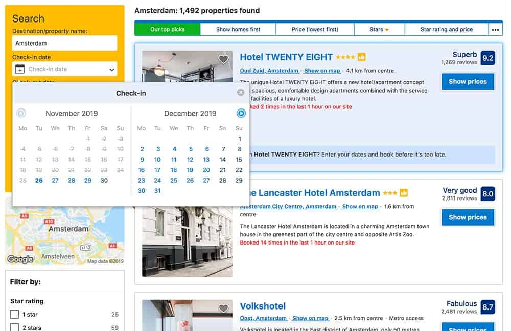
Booking.com let its users navigate through their website and app according to the below-mentioned filters :
- Your Budget
- Popular Filters
- Recommended for You
- Star Rating
- Distance from the centre of the city
- Fun Things to Do
- Availability (on dates you enter)
- Deals
- 24-Hour Front Desk
- Reservation Policy (Free cancellation, no pre-payment)
- Meals
- Stay Type (boutique hotels not an option)
- Property Type
- Landmarks
- Bed Preference
- Review Score
- Facilities
- Room Facilities
- Neighbourhood
- Chain Hotel
- Property Accessibility
- Room Accessibility
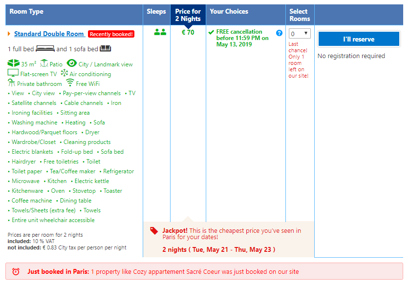
Below, there are prices and the features of a hotel room on Booking.com which includes the key information. It includes certain tricks when it comes to user behaviour:
- It highlights competition with other users (“recently booked”).
- It emphasizes the scarcity of the rooms (“last chance”).
- Arousing the thought of winning and luck (“jackpot”). This incites thoughts and emotions which makes users feel exclusive and appealing.
In addition to these forces that push users to action, the site also uses means to pull the user in.
- It showcases an excessively long list of features which even mentions toilet paper and heating are mentioned. These serve to highlight the value user is getting.
- Less on the icons and symbols.
- Omitting the barriers of booking - The reservation does not require registration and allows the user can also cancel it. Yet, the likelihood to cancel a made reservation is low which they very well know. This makes it profitable to offer this possibility.
Zomato
Zomato is a popular online food-delivery and restaurant review app. Besides placing an order and delivering food, Zomato stands out with the following USP:
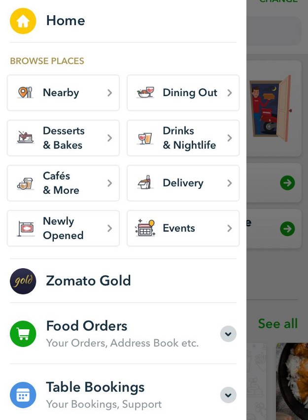
- Food ordering: Allowing the users to order their food on the go.
- Table Booking: Enabling the users to book a table at the restaurant of their choice with just a few taps and the wait time at the restaurant is eliminated!
- Explore Places: Offering the discovery and guide to the user for exploring nearby restaurants with pictures and map locations.
- Zomato Gold: The subscription model that offers an exclusive dine out and social drinking membership with special perks of its own.
- Zomato also offers a pretty good filter for finding restaurants based on distance, events, delivery, and type of restaurant. They also have a newly opened section that can get foodies and food bloggers to come back to the app.
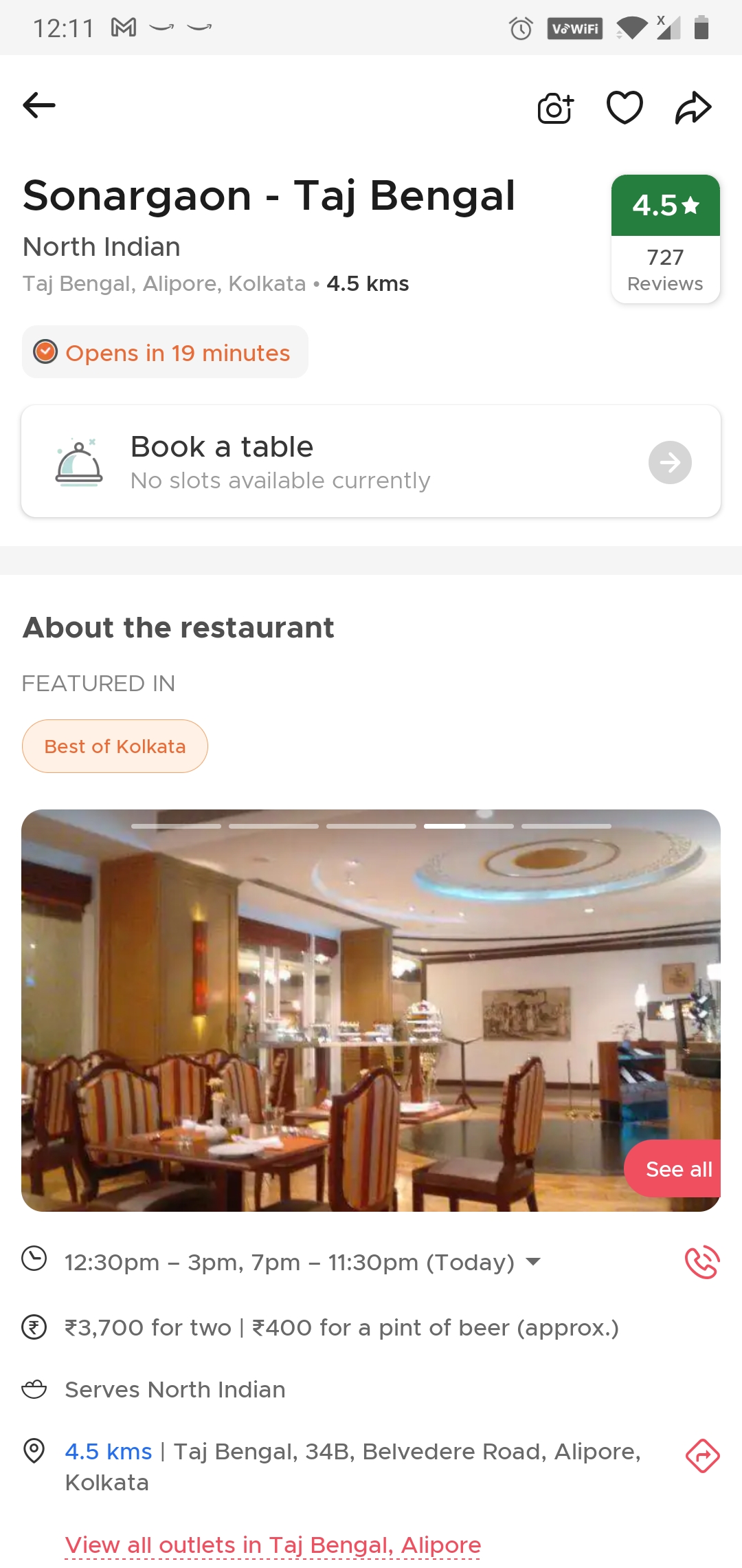
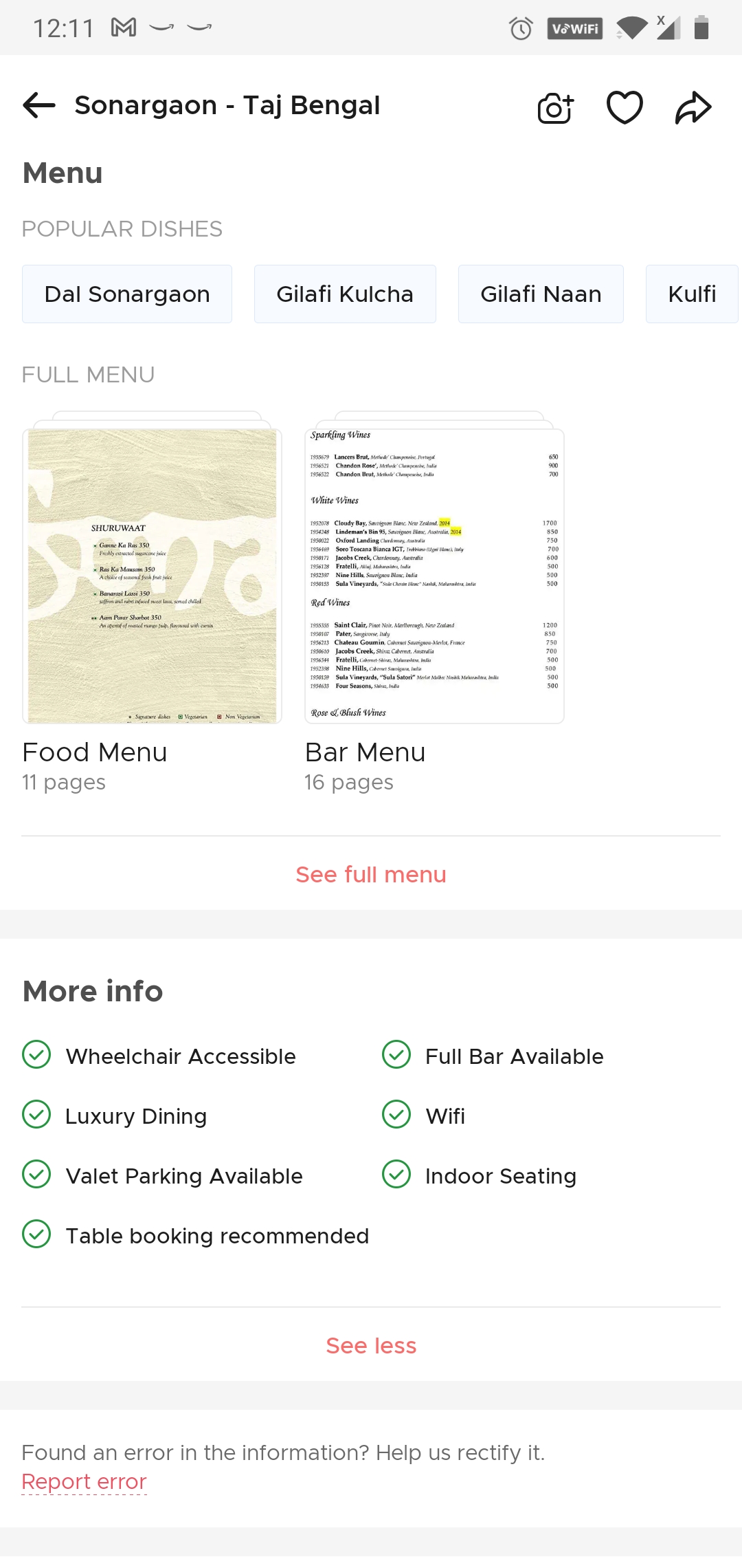
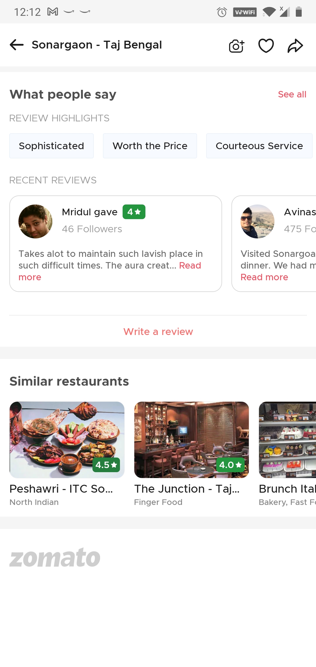
A typical restaurant on Zomato will have an overview (or profile) page as mentioned above. This is where users will land once they decide on a restaurant. Here they’ll view photos, contact info, opening hours, address, average cost, and website. The profile also includes other specific elements like cuisines if the place offers breakfast or free WiFi. Each restaurant profile has buttons for users to navigate quickly through Zomato. A user can choose things like “Bookmark,” “Been Here,” “Order Online.” Customers can also view the menu. All profile visitors are also able to rate your restaurant and write a review. This creates a sense of community users/customers can trust and come back to again and again. Here are some additional fields one can fill out in any Zomato Listing:
- Address/landmark
- Alcohol availability
- Services (Lunch, Dinner, Nightlife, etc.)
- Seating availability (if available, specify whether it is indoor or outdoor)
- Payment options
- Cuisine types
- Miscellaneous tags (Free Parking, Entry Free, ATM, etc.)
- Hours of operation
- Contact information (restaurant email and phone number)
NoBroker
NoBroker offers a peer-to-peer property listings platform designed to make real estate transactions efficient. The company’s platform makes it possible to buy, sell and rent a house without paying any brokerage fees and find all the listed properties in a single place, enabling users to make informed and profitable decisions easily.
Their feature such as personalized assistance from a dedicated Relationship Manager
- Interact with house or property owners/sellers and tenants or buyers
- List house or property by uploading images
- View flat, apartment, house, shop, office or property images for a quicker shortlisting process
- Offers filters to search based on rent, amenities, BHK, parking availability and more
- Help users explore the locality of the house or property you choose, based on distances to shops, schools, restaurants, and other utilities.
- Provides map for better understanding the locality in which the property is listed
- Both owners and tenants receive contact details of each other along with the description of the house
- The app also helps with Rental Agreement that can be delivered at the doorstep. Thereby reducing the hassle to visit a government office
- NoBroker helps to roll out instant Rent payments and receipts
- Helps owners to mark a flat, apartment, house, shop or office as ‘Rented Out’ by owners, sellers, tenants or buyers
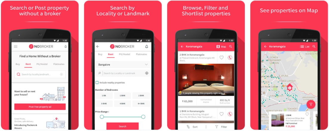
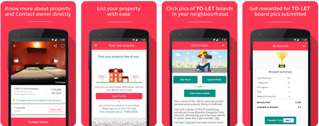
NoBroker also offers Packers and movers services, screenshots of which is mentioned below -

Makaan
Makaan.com is an online real-estate service that helps users make decisions regarding buying, selling, renting, and leasing properties in India.
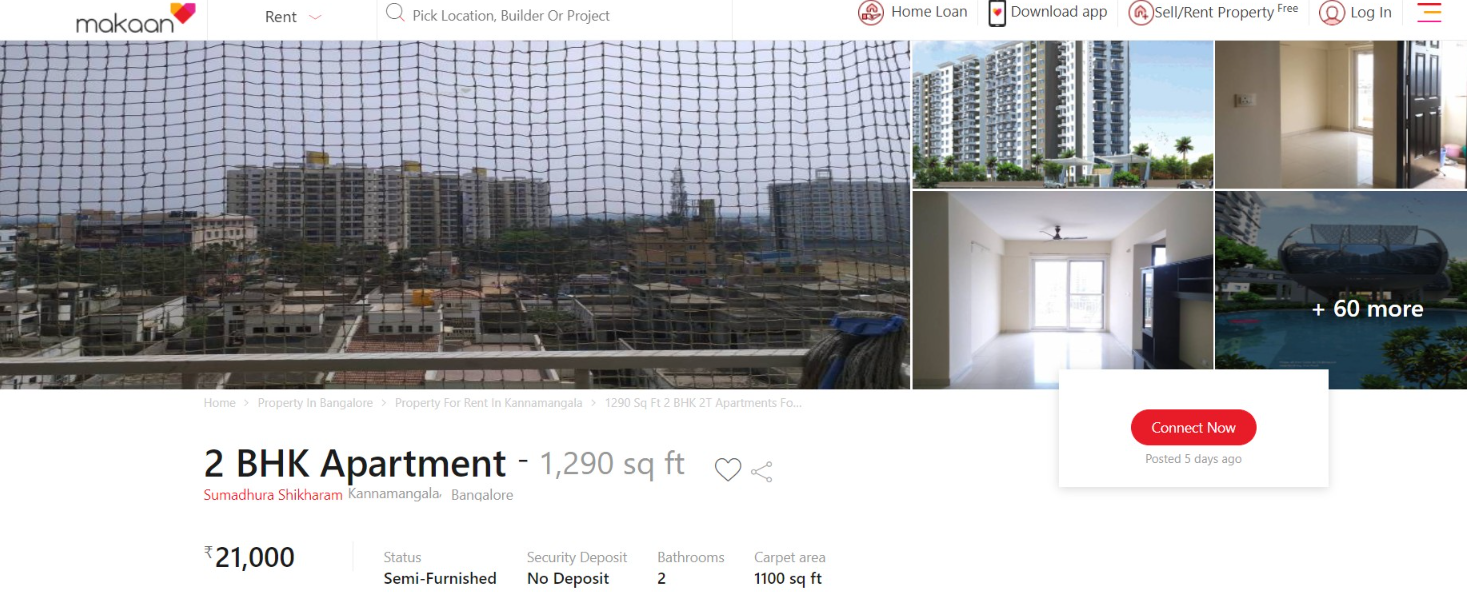
After choosing an apartment of choice, the website shares primary information like photos of the property along with the rent, status of the property, area, no. of bathrooms and security deposit charges.
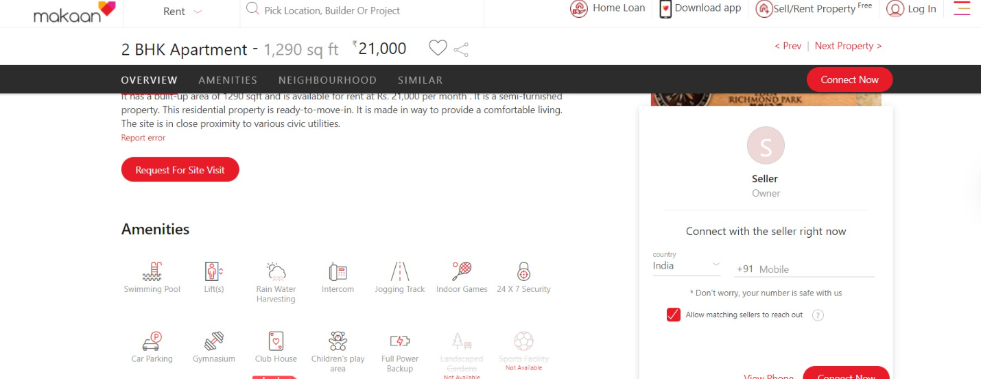
The website then puts up additional information like an overview or a short description of the property. Amenities available at the property are shown in icons which are self-explanatory and makes it easier for a user to go through.
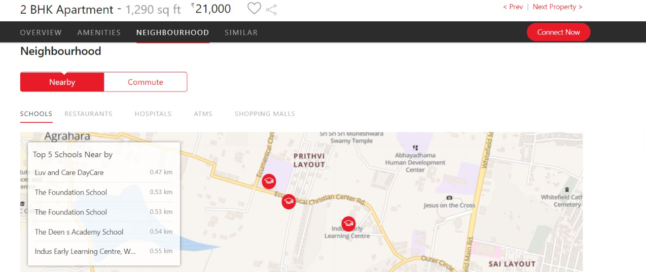
Other information includes Neighbourhood that shows the nearby areas and comes with a map. The website also includes a Similar category at the end for users to view similar properties which helps users to explore more in case of any doubts regarding the current property they are viewing.
Insider.in
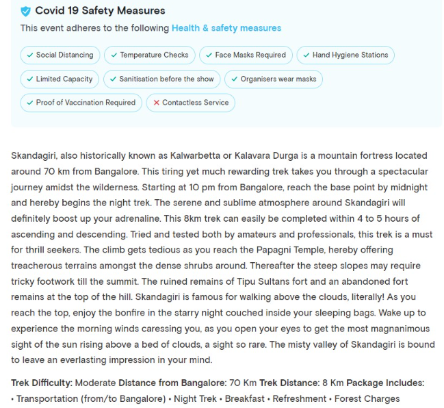
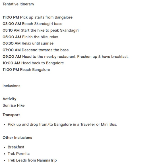
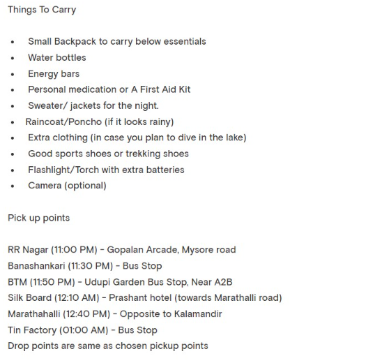
Example of multiple instructions mentioned for a one-day trek event - Skandagiri Sunrise Trek | Nammatrip The Event details start with COVID Safety Measures, followed by a description of the location and Trek Difficulty. The other instructions and pieces of information include things to carry, itinerary, transport, inclusions, etc.
